A chaotic multiplayer game on Switch, PlayStation, Xbox, and PC!
I’m in charge of all things 3D as well as art director for the game
Our trailer of the game and art style.
It has been an absolute blast to work on this game. It’s charming, simple and reminiscent of toys we all played with as children. Originally, during this project I was provided with specific design structures in order to adhere to the project’s intended aesthetic such as measurements for models or storyboards for animation. However, after talking with the designer of the project about his uneasiness of the art direction, I offered to step in and work together to create the aesthetic feeling of BOMBFEST that I knew he wanted his audience to feel.
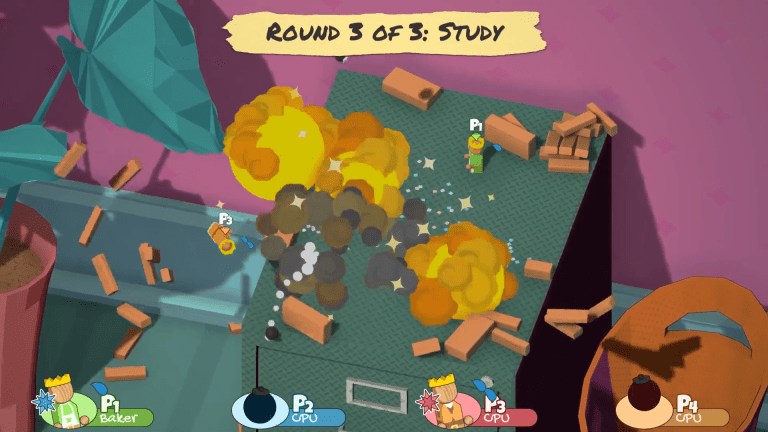
I decided to reflect on the strengths and weaknesses of the current style. The characters ooze cute as they tumble around the playing field with their brightly saturated color-scheme; however, the realistic color palette for the play fields dulled those qualities, and the area surrounding it appeared empty. There wasn’t a structured idea of where exactly the player was playing which made the art more lackluster compared to other party games.
An old design of the bedroom level The gameplay is charming, bouncy, and silly, so the environment needed to compliment those qualities.
I put my nose to the grindstone, researched what worked for other games, and developed what I thought would be the best fit for BOMBFEST’s established style. I stuck with these concepts:
Keep all assets low-poly to remain consistent with the player characters
Find a color palette that compliments the player characters but keep them the most saturated assets on the field
Establish a scene within each level as if a child were playing in each room of the house (this idea derived from the designer’s original inspiration for the game)
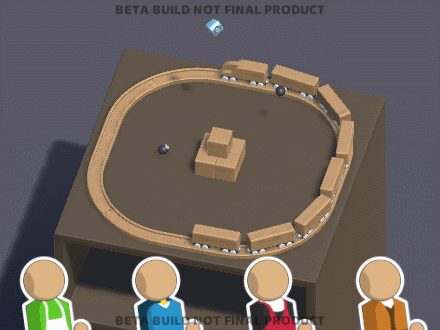
A camera feature that zooms towards the playing field to establish a sense of the placement within the environment as well as one that swipes each level across for a concise and fluid transition
Keep the isometric view for the playing field, so make the main environment share that perspective to avoid audience confusion when zooming-in the camera
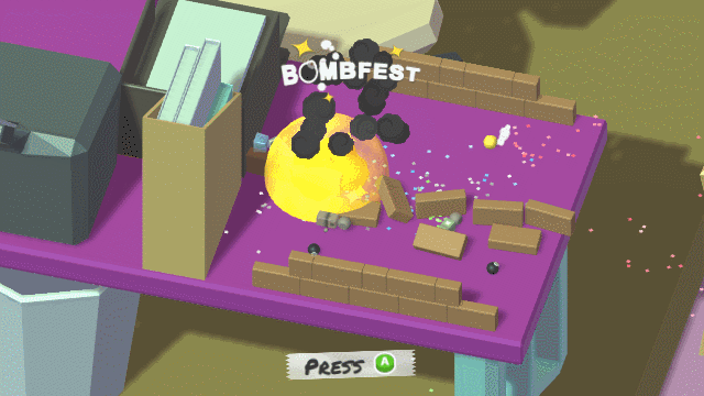
Implement vivid lighting variations per level for a warm, playful mood
I had a week and a half before our big showing at the Game Developers Expo, so I set to work redesigning each room’s layout. I spent most of my time creating sets that kept the players eye within the ‘diorama’ of sorts through furniture placement and leading lines. Ultimately, I wanted the player’s eye to naturally be drawn to where the playing field would be placed to create a sense of curiosity that would be answered by the camera moving into the playing field. This is why the smaller background assets in the scene are simpler shades compared to the more larger, more complex assets whose silhouettes move the player’s eye around the scene.
Living room level
Meanwhile, I wanted playing field’s environment to keep the player grounded within the space, so I also used leading lines to center the focus on the playing field. I intended that the player wouldn’t be too distracted by any of the assets surrounding the characters; they needed to compliment rather than overpower the game-play.
My designer enjoyed the clean look of the simple topology from the original asset designs, so I refrained from altering the softer edges of the inorganic assets that made the scene that much more playful and ‘kid friendly.’ Instead, I wanted to contrast those textures and vary the scenes by creating rough, organic shapes.
An example of the camera transition from level to level to playing field.
The color palette and lighting are all rooted in the player character’s color schemes in one way or another. For many of them, I de-saturated the colors and used triadic color schemes for a distinctive yet cohesive colorization. Pop art was a heavy influence for how I wanted to approach balancing numerous bright colors, but the variance in colored lighting with soft shadows added that final warm and festive atmosphere I sought to develop. As time progressed, I found further inspiration in pop art culture and decided to implement halftone textures for each level. Some materials are specifically made to create a sense of texture resembling the real world; for example, wooden objects tend to have halftones that resemble grain patterns. This adds contrast to each scene and makes them pop that much more. Post-processing has also been added to create a better light balance; who knew staring at the screen for three hours at a game development conference could point out how much strain lighting and overly saturated models could do on a large screen television? Now, I’m much more satisfied with the overall lighting and look of the characters. New shaders were implemented especially for the characters and other interactables to help them stand out.
The game has been released since 1/31/2019, so keep an eye out for it on our website www.playbombfest.com!